
Well, friends, ArtPrize has come to a close. I picked up my piece just yesterday from my venue, and it’s safe and sound back at home. What an experience! I’m excited to partner with Georgia-Pacific today to talk about color, and how a little hint of color can make a world of difference. If you haven’t seen my entry for the 2014 competition, Tree at Dawn, let me share:
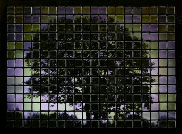
As you can see, I LOVE the silhouette look, which is traditionally a black-and-white look. But that just wasn’t as inspiring to me as adding a hint of purple and green to the image, before turning it into this tile mosaic.
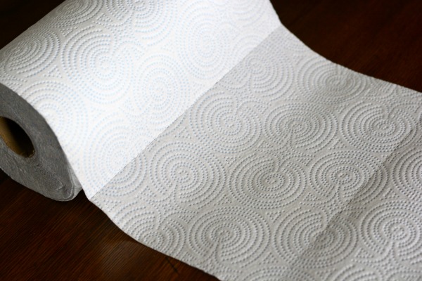
The original photo started out like this:

I mean, I LOVE the tree, and I saw the potential. But, it’s a little “blah” for color, though. I knew I wanted to enhance it, and honestly – I AGONIZED over the color scheme! I spent days choosing my colors, and the final shades of those colors, because color is important. It conveys so much… the right color can be calming, or energizing, or comforting – or hopefully, inspiring. That’s what color means to me, anyway. So I designed a color scheme centered around light, specifically re-creating an early-morning look, in colors that inspired me and complemented our green walls. I glazed it so that it shines.

Now – the people at Sparkle® totally get this! We embrace color in our lives. Even if you’re not an artist, everyone has colors that they appreciate. It doesn’t have to be flashy, or bright. But a hint of color is something we can always connect with.
The subtle blue hue in Sparkle® towels with a hint of color is a soothing, happy color to add to my kitchen. I don’t like most of the patterns on other towel brands (they’re always “rustic charm”… SO not me!) so I usually settle for white. But having the hint of blue is perfect for my mostly-gray kitchen. The style is simple. Clean. And not at all plain.
I actually got a fun kit from Sparkle® – letting me play with color on a bigger scale in my kitchen. Not only did I have the opportunity to use the Sparkle® towels with a hint of color, but they sent a great gift!
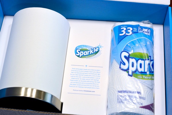
In addition to the towels, there was also a beautifully simple lamp with the subtle Sparkle® pattern, and an Ilumi bulb to create a color scheme of my own. (I could write a whole post on what these bulbs can do, but that’s wayyy off-topic. I’ll sum up by saying, you can create any color scheme you can imagine, in varying intensity and brightness, with one of these LED bulbs with an app on your smart phone.) The lamp was a really nice new way to bring more color to our kitchen.
Obviously, the first scheme I tried was to match that same color blue. :)

We liked it so well there in the kitchen that we turned the brightness down nearly all the way, and we use it at night, for when my husband gets home from work late. Because a calming blue is perfect for settling in at home after a long night at work – despite my daughter’s pleas to have it in her room, set to bright pink. :)
That’s right – even at age 3, my daughter is already connecting to light and color… even if it’s not the SAME colors I enjoy, haha. I think it’s just a natural response – which is what makes me love art so much in the first place. Even if you don’t study art, don’t know technique, and don’t consider yourself artistic – nearly everyone can spot pieces of art that they enjoy, and we choose to surround ourselves with art and decor in our favorite colors all the time. Sometimes it’s a big, important piece, and sometimes it’s just as simple as kitchen accessories, like Sparkle® towels with a hint of color! :)
Right now you can save $1 off your next Sparkle® towels purchase, too! Just click the link for the printable coupon for packages of 6 rolls or larger.
![]()
So, what’s your favorite color? Do you decorate with it? Wear it? Surround yourself with accessories in that color?

This is a sponsored post written by me on behalf Georgia-Pacific.
i’m currently into very neutral (a.k.a. boring) colors that are easily replaceable when the kids mess them up. :)
Oh, Adrienne. It’s beautiful! Did you win?
Hi Grace – no, I didn’t, haha. Thank you, though! It’s a huge competition, and a huge piece won (a huge prize, too). I was just happy to be accepted into the competition and be part of the art this year!
Your art work is amazing, Adrianne! And you’re so right – what a difference is made by that pop of colour!
Very cool that the towels have a hint of blue. My marble backsplash has a slight blue tinge… they would look great partnered together!
My current favourite colour is orange – my kitchen is orange (floor), red (curtains) and yellow (walls). I have some clothes in orange and an orange (literacy) wrist band. I have never seen a tile mosaic so striking!
I love your tree picture!! You chose the right colors!! Love it!!
This is such a lovely mosaic! You are so right about color. Blue is my favorite color and it’s everywhere in my home!
First off, your Tree at Dawn always blows me away every time I see it! My all time favorite color is red but I must say that in all honesty, I just LOVE color….all color!
First that has got to be the coolest light ever! i totally agree color and art make a huge difference to us. The more we love and enjoy our surroundings the more we will enjoy doing things in those surroundings.
I don’t really have a “favorite” color, I love most colors. Bright colors are my favorite. However I”m learning to APPRECIATE white much more than I have in the past. :)